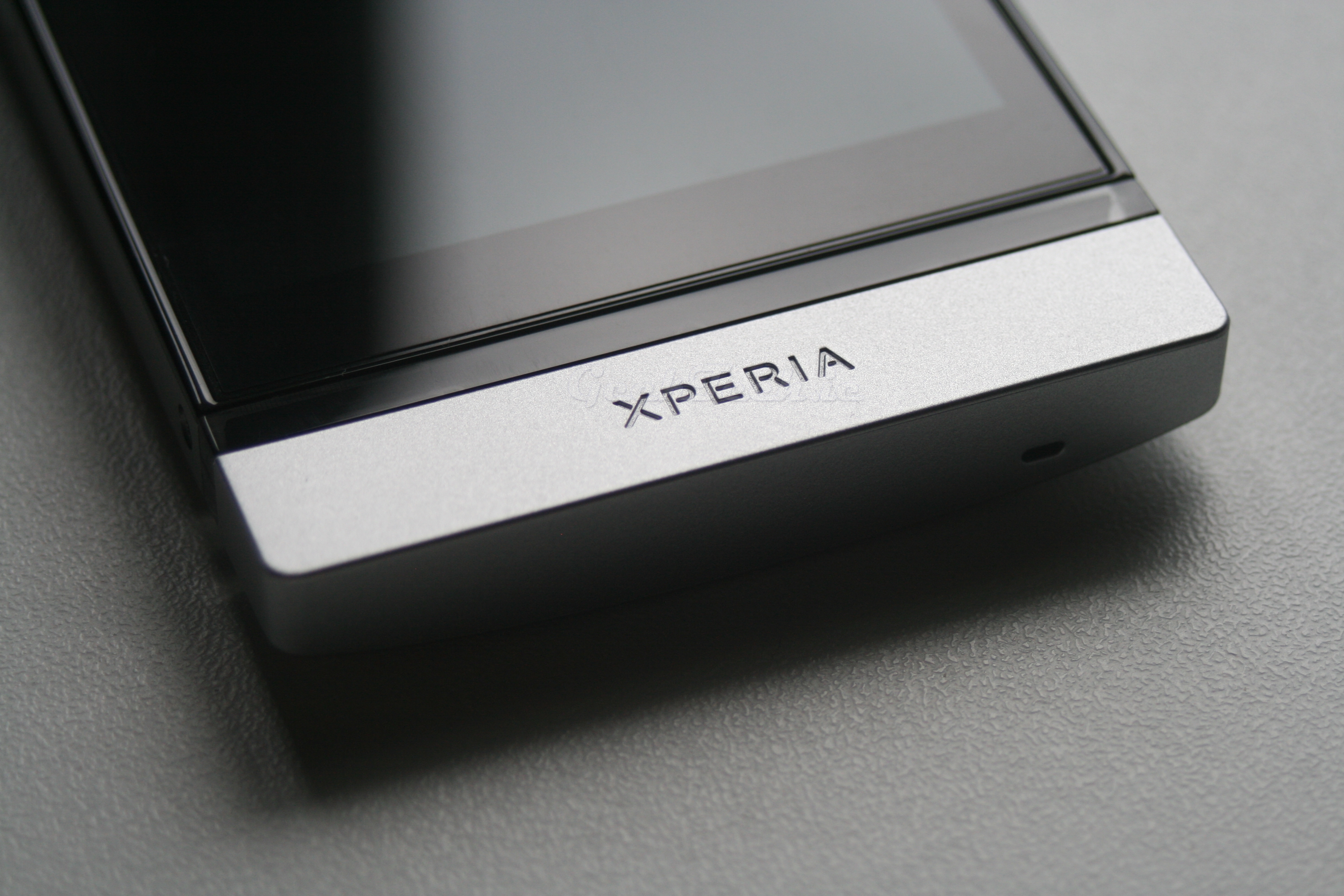
Sony Mobile(Previously Sony Ericsson) have released their newest series of Android devices all with a similar design. We are here to take a look at the Xperia P. This is mid ranged device that brings with it a serious design. So let’s dive right in and check out what they are on paper.
- 4.0 Inch LED 520 x 960 display with Sony WhiteMagic and Mobile Bravia Engine
- Dual-Core 1 GHz Cortex A9 Processor
- NovaThor U8500 chipset
- Mali-400MP GPU
- 1GB of Ram
- 16GB Storage Memory
- 8MP Camera with 1080p video and Autofucus
- Front facing VGA camera
- Dedicated Camera button
- Micro USB
- Micro HDMI out
- 1305 mAh
- 122 x 59.5 x 10.5 mm
- 120g
Now, some specs stand out, while others just seem dated for a new phone. The main concern of this device is that it’s a new device that is loaded with Gingerbread, no ICS love for this smart phone yet. Now the ICS upgrade is expected for this device, but it seems odd to push out a new device with already dated software. That being said, there is nothing wrong with Gingerbread and it is still the most used Android OS on the market. So we aren’t expecting many issues here.
Unboxing
Now let’s take a look at the device packaging and contents and of course the device itself.
 The box is a simple flat pack design which details specs of the Xperia P, all in all it’s pretty straight forward.
Sony didn’t skimp on the accessories on the Xperia P, we have the USB Charger, Micro USB cable, Micro HDMI cable, Earphones, Screen protector and of course the manuals. It is nice to see an included HDMI cable as we generally don’t with smartphones.
The high right side of the device sports the speaker, power button, volume rocker.

The lower right side of the device contains what seems to be missing from a lot of smart-phones these days and that is a nice dedicated camera key, which also sports two click action for focusing.

The left side of device has both the Micro USB connection and the Micro HDMI out. It’s also the area of the Micro Sim slots. I know, a lot of Micros in there.

The top of device has houses the typical 3.5mm headphone hack.

The bottom of the device is where the transparent line is and this contains the nice capacitive buttons. We have the back button, the home button and the menu button. This part of the device also has built-in LEDs and glows, which is pretty nice. The silver end of the device is actually replaceable with different colours like black and red.
The back of the device we can also obviously see the transparent line for the navigation buttons, we also have the Xperia stamp and Sony Mobile logo. The entire device is nice full aluminium unibody design and this means there is no access to the battery.
 The back of the device has a nice NFC sticker to let you know it has NFC. We also have the 8 Mega Pixel camera with LED Flash.
Page 1 – Specifications and Design
Page 2 – TimeScape UI
Page 3 – Camera performance
Page 4 – Benchmarks
Page 5 – Conclusion


Looks fantastic!