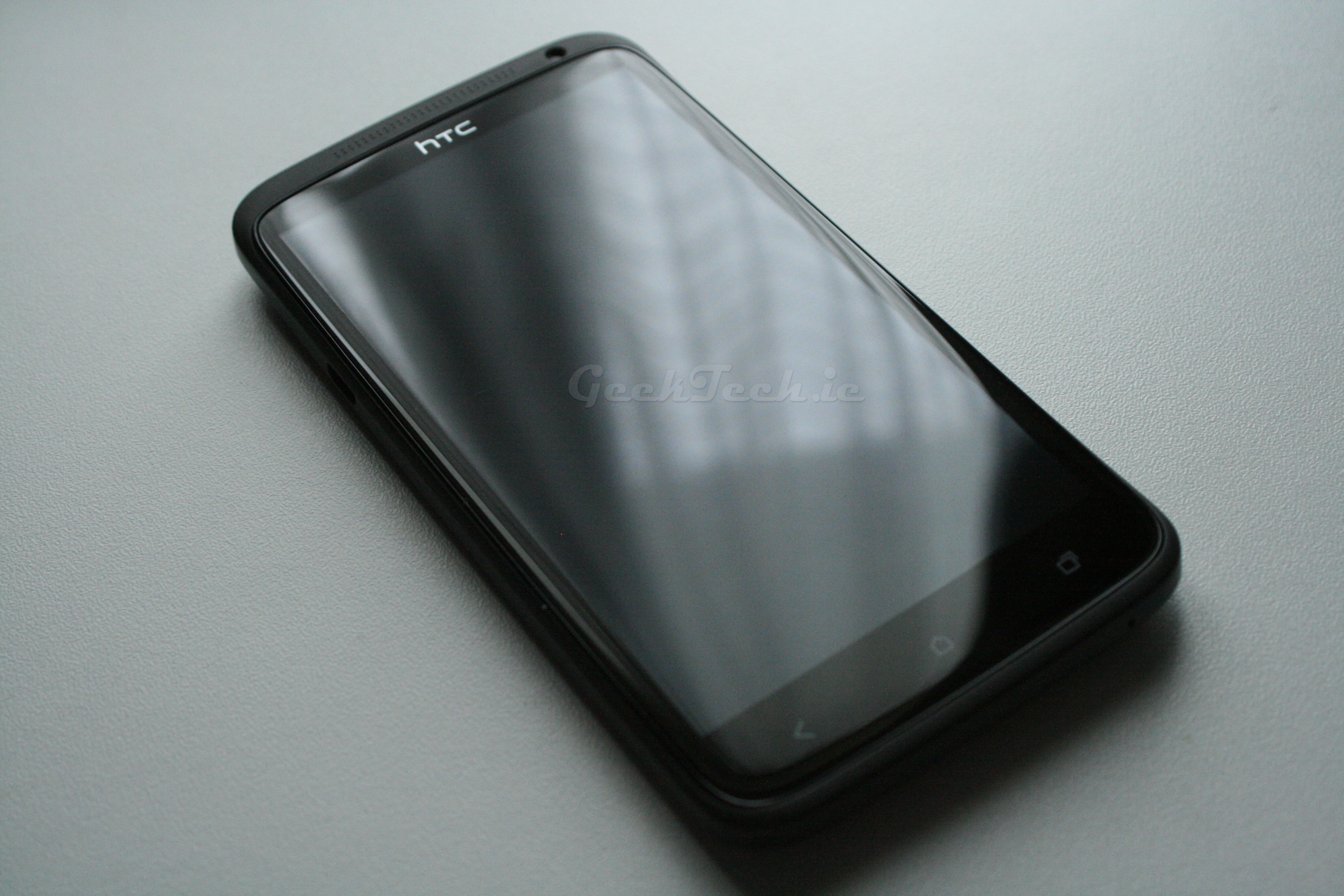
HTC Sense 4.0
Now in terms of launchers Sense is probably one of the most liked as with most other devices they either have a customized version or stock android launcher. The issue here is that there is tons of third-party launchers that offer significant features that no stock or customized launcher provides. That being said the HTC Sense 4.0 is actually pretty nice to use and extremely smooth. Let’s take a look at some screenshots of the new launcher.
 This is the lock screen, It’s pretty straight forward in terms of layout. To unlock you simply drag the circle to anywhere on the screen. If you drag it to one of the icons, it will launch that application directly. This is pretty good for making quick calls or bringing up the camera app itself. It works well and is very responsive.
Now we have the main home screen. Here we have the typical weather widget, which has a nice look to it. The home screen is very much like every launcher in terms of customizing. All the icons on the dock are changed except for the app drawer launcher. You can have a maximum of 7 different panels on the home screen.
The app drawer, again pretty straight forward with the layout. HTC have included three different lists for all apps, most used apps and downloaded apps. Useful features but they have been seen before on third-party launchers.
The top of the app drawer there is also icons on the top right for searching all apps, going straight to the Play Store and the menu button. Through the menu you can sort the apps by A – Z, Date (Most recent) and Data (Oldest). You can also go straight to the app manager via the menu button aswell. There is also a function to edit the tabs and have specific apps show up in each.
As with all launchers, you can customize them with widgets, apps and shortcuts. You can either just hold on an app in the app drawer and then drop into onto a panel or you can hold a finger on an empty area in a panel and then add a series of widgets, apps and shortcuts. This is pretty forward and similar to most launchers on Android.
Android 4.0 brought with it the ability to either switch or close apps that are being either used in the background or just recently used. Normally this function meant swipe ones finger left or right to closer it. HTC have made a more WebOS style cardswitcher and the user swipes up to close any specific app. It would have been nice for HTC to include a close all button to easily remove all apps from the multitask menu, but this could be added by a software update.
The settings for the Sense 4.0 have a different style to them, but their over all layout is fairly similar to that of stock Android. The layout is pretty straight forward and you shouldn’t have an issue navigating the layout. That’s pretty much it for the Sense 4.0. It’s probably the only shipped customized launcher I would actually use and in terms of performance, it’s extremely smooth and the layout is nice and easy to get accustomed too. That being said, the stock Android 4.0 launcher also has its points. At the end of the day, If you do not like Sense 4.0 and if you wish to use a third-party launcher you can easily do so. That is the great thing about Android.


Cannot compare the video with that of the S3 as this is taken in a low light situation, pity this video was not taken near the river during the day so we could compare like with like
I Will take another video in a similar fashion and update the review. It’s always good to have similar videos. I normally do, Will have it updated shortly.